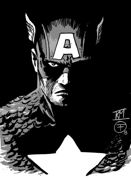
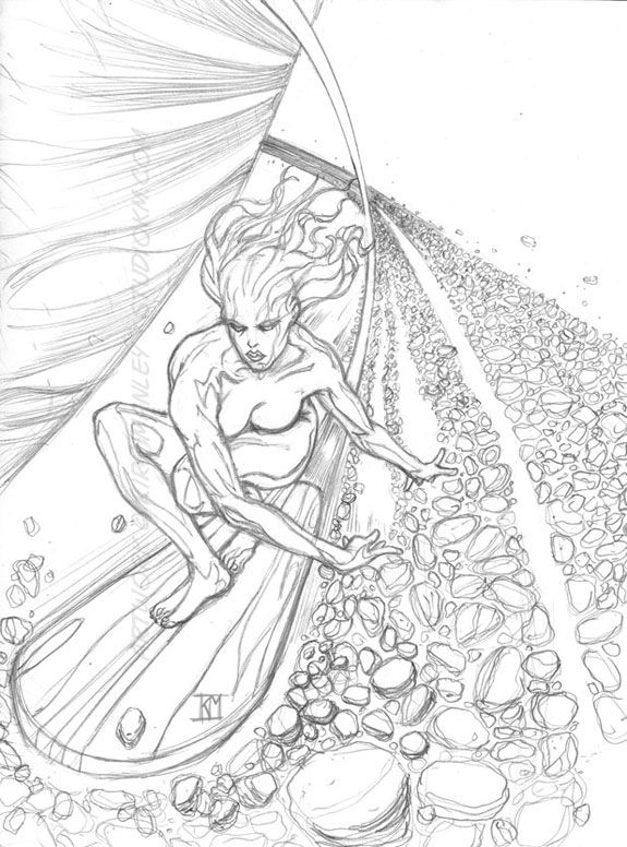
New Silver Surfer Babe & Cap inked by Francavilla

BATMANKM

Shared on Tue, 07/08/2008 - 11:38

Ok that last Silver Surfer Babe image I posted a couple weeks ago was one of the most bland things I have ever done. I hold my head in shame. :oops: :lol: I have wanted to do something more dynamic and interesting using the idea of a Female Silver Surfer ever since I posted that bald headed silver man with boobs. :lol: :lol: So this week i am posting up a new interpretation. Now im much happier with this one but it still has issues. The pose is from a reference shot but its not completely working. The left leg is wiggy. Its like we are looking up at it while looking down at the rest of the figure. Oh well, its a work in progress. :D If you want to see the original reference image for the pose, as well as a couple quick revised leg sketches you can see em over in the super heroes thread at the drawingboard HERE. The reference image is slightly not safe for work, so i didn't post it here. :oops:

Secondly Im posting up a piece that is a collaboration with one of my fellow forum artist over at the DrawingBoard.org His name is Francesco Francavilla and he is the current artist on Dynamite's Zorro comic. He is very talented and worth checking out at his site, HERE, if you have a second. I posted the Captain America piece I did last week over at the DrawingBoard and he re-cropped it and threw some inks on it. It came out so very cool I figured I would share it with you all. :D

Enjoy and see ya again in a few.

Peace

BAT


Comments

BATMANKM's picture
Submitted by BATMANKM on Tue, 07/08/2008 - 15:53
Very cool. He looks even more bad ass and pissed off with 2 eyes. :lol: I totally dont mind either your critque or your altering the piece. :P Its the point of posting the work to get feedback. So I thank you for taking the time :D I think I like it both ways to tell the truth. :D - BAT
BATMANKM's picture
Submitted by BATMANKM on Tue, 07/08/2008 - 16:05
Hey Beefy I just posted up to your Blog dude. Im sorry I seem to have missed a bunch of your recent posts. My bad. :oops: - BAT
CapnHun's picture
Submitted by CapnHun on Wed, 07/09/2008 - 16:35
Those both are very cool. I am trying to figure out what seems wonky about the surfing picture; I believe what is bothering me is that the hair is streaming straight back so would the force of the wind also be seperating her breasts and causing the right one to lean back to the left instead of them both leaning over to the right?
Lbsutke's picture
Submitted by Lbsutke on Tue, 07/08/2008 - 12:09
cap is cool....Uber dark...as in scary...like he is about to throw out his morals and just take somebody and their family out!!!
beefynutcase's picture
Submitted by beefynutcase on Tue, 07/08/2008 - 12:17
Very nice, man!! Gawd, the detail you put into this stuff, I don't think I'd ever even attempt to draw all those little rocks. Very cool surfer pose you have her in too. Dude put some sick inks on that Cap. One thing that kinda stands out to me though is the one eye being visible, I think it might be more dynamic/accurate with both eyes being covered in shadow. When I first saw the pencil version I thought he was wearing an eyepatch.
wilderz's picture
Submitted by wilderz on Tue, 07/08/2008 - 12:32
That surfer babe is Tres cool man! The pose is a little wonky like you said, but kudos for even trying it! Yeah, and all those rocks.... more patience than I have!
NutmegeR's picture
Submitted by NutmegeR on Tue, 07/08/2008 - 13:24
Wow, you are good! Great detail on everything.! I was going to say something about the pose as well, but after seeing the reference shot, I guess I have nothing to say–unless the reference pose just doesn't work in this case. I like the other suggestions someone gave you on the site you linked to. There is something about the neck/shoulder area that seems a little "bulky", but as you said...it's a WIP. Again, great work! Love the Captain America piece as well!
BATMANKM's picture
Submitted by BATMANKM on Tue, 07/08/2008 - 14:24
lbsutke- I agree, and think thats what makes it so cool. Also the fact that I would not normally ever illustrate him to look that way so to see someone take my pencils and transform it so much by just inking it, blows my mind. beefynutcase - Thanks Beefy. yeah i get a little crazy with the details sometimes. Its my thing. LOL I dont know on the eye thing. If you follow the link in the previous blog where i first posted the Cap pencils you can see the Punisher movie poster designs I used as a base for the Cap shading. It does in fact have both eyes blacked out. I chose to add back in one eye in order to make a connection with the viewer. I also wanted Cap to look tough not depressed or dead/zombified. LOL And I was afraid that with both eyes darkened thats what would happen. May have to try it and see how it looks. :-) wilderz - Glad you like dude. Thanks for the props. :-) NutmegeR - Thanks man. Glad you like Cap. :-) Yeah on the Surfer Babe in addition to the leg, Im still struggling with her right side, our left as you look at her. Its not reading as her back like it is in the reference image. Its reading as a big lump. :-(
beefynutcase's picture
Submitted by beefynutcase on Tue, 07/08/2008 - 14:44
I took that Cap into Photoshop and blacked in his other eye and you were right, the pic did come across as looking too dark and brooding. However, I then Copied, Pasted, and Flipped his right eye to create his left and I think the pic works a lot better. Hope you don't mind my critique and that I altered your piece. :) Just thought it was an awsome pic but the eye issue was keeping it from being perfect.
beefynutcase's picture
Submitted by beefynutcase on Tue, 07/08/2008 - 14:46
If you wanted to see what I meant and judge for yourself: http://i153.photobucket.com/albums/s224/beefynutcase/c7ee763a.jpg

Join our Universe

Connect with 2o2p